

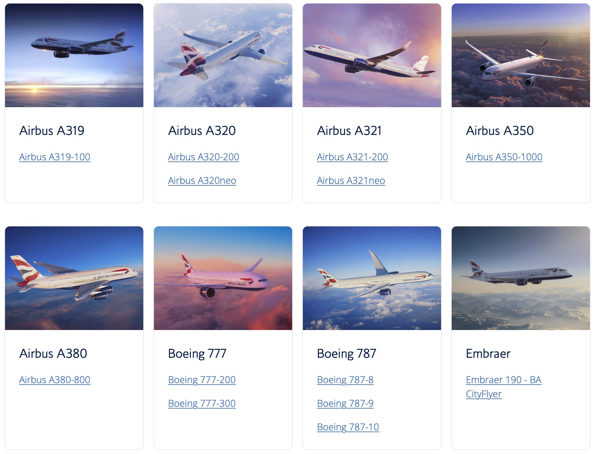
Nearly a decade ago I wrote an article on the experience of travelling as a British Airways Gold customer, but from an unusual perspective: the son of a long-serving British Airways employee, viewed through the eyes of a management consultant armed with a telecoms engineer’s toolkit. The resulting article, originally published on LinkedIn (a platform I have long since abandoned), gained enormous traction. It now lives on my own legacy website, and even led to an interview with a well-known travel industry commentator.
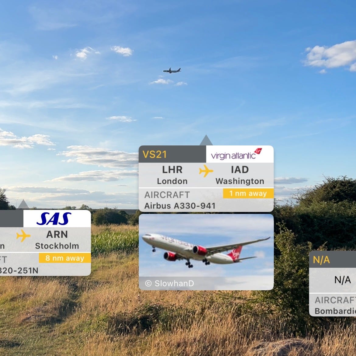
I have multiple times walked home from Heathrow to my parents’ house in Staines-upon-Thames. It’s about 50–60 minutes from Terminal 5, and quite pleasant if you know the back route via Staines Moor. Tramping across that open space this afternoon, one of the last “wild” areas around London, I was watching a succession of BA flights take off and tracking their destinations using augmented reality. The particular structure of the British Airways livery struck me as unusually effective branding.
As well as simply admiring it, I started to analyse it using GTFO (Geometry–Topology–Field–Observability): the mental “Swiss Army knife” that emerged from years of legal and constitutional work, and which I introduced in a previous article together with a downloadable AI prompt. What followed surprised me. A simple airline paint scheme turned out to be an unexpectedly rich teaching case for understanding how GTFO separates appearance from structure, purpose and runtime.
GTFO! A "CT scan" for bureaucracy

Over the last few months I have been making the intellectual and practical case that certain aspects of bureaucracy can be analysed using well-established engineering principles.
My purpose in sharing its application to British Airways is not to “sell” you the tool, but to illuminate its methodology using an example that avoids all the controversy of rigged courts, child trafficking, election fraud, or other emotionally charged subjects. Indeed, it is something of a relief to explain why an organisation is best in class, rather than diagnosing institutional failure.
As an unexpected bonus, the exercise helped me understand something about my own earlier work. Looking back, that original British Airways article was already a prototype of the observational method that, years later, I refined into the more formal Geometry–Topology–Field–Observability (GTFO) framework. I simply lacked the vocabulary at the time to explain what I was actually doing.
I hope what follows both amuses and educates. If nothing else, you may never look at an airline paint scheme in quite the same way again.
As a prelude, let me briefly recap what these four terms mean in the context of GTFO:
Geometry is the visible manifestation of a system: its shape, structure, components, processes and relationships as they appear to us. It answers the question: What is happening?
Topology asks a different question. It concerns what remains the same when the geometry changes. Stretch, compress, reorganise or substitute parts, and yet some deeper structure may still be preserved. That conserved structure is the topology.
There are many different properties that could be preserved. The Field is the governing invariant that determines which continuity matters. It expresses what the system fundamentally exists to serve, and therefore which topology deserves to remain intact.
Finally, Observability is concerned with the runtime that actually exists, instead of one we imagine or claim to have built. It reconstructs the underlying system from the traces it emits, allowing us to distinguish aspiration from operational reality.
In airline terms, these concepts map quite naturally:
The Geometry of the livery is how the paint is arranged across the visible surfaces of the aircraft.
The Topology is whether that branding survives changes in the aircraft itself. Does the identity stretch naturally from an A320 to an A380, or does it only work on one particular shape?
The Field is the unconscious message the airline wants to communicate. Before you have consciously read the name on the fuselage, what feeling or identity has already been conveyed? Calm? Prestige? Nationality? Innovation? Reliability?
Finally, Observability asks whether the intended runtime is actually recoverable from reality. Can someone standing two miles away, with less-than-perfect eyesight, watching the aircraft pass at 200 mph, still reconstruct the airline’s identity? Or has the message been lost between the designer’s imagination and the real world?
Now let us apply this to the British Airways livery.
I make no apology for using AI as a thinking partner in this exercise. The objective is not to demonstrate essay-writing prowess, but to teach a method of analysis. If AI helps expose the structure of the problem more clearly, then it is serving exactly the purpose for which I use it.
So let us descend through the four layers—Geometry, Topology, Field, and Observability—and see what they reveal about one of the world’s most recognisable airline liveries.
Geometry
At first glance, the British Airways livery comes over as conservative. The upper fuselage is white, the underside a deep navy blue, and the tail carries a stylised Union Flag. It is elegant without being flashy.
Look a little deeper, however, and the geometry begins to tell a story.
The dark blue is not simply “underneath”. It visually occupies the part of the aircraft where all the technical complexity lives: engines, landing gear, cargo holds, systems, fuel and structure. Above that sits a vast expanse of white where the passengers travel.
The aircraft has effectively been divided into three layers.
The deep blue underside represents the mechanical foundation: engines, landing gear, cargo holds, fuel, and avionics. It runs almost the entire length of the aircraft, becoming less a painted surface than an architectural plinth.
Above it sits the world inhabited by the passenger: bright, calm, and spacious.
Finally, concentrated at the tail, comes national identity. British Airways is not shouting “Britain!” at the viewer. Instead, nationality crowns an already coherent machine.
That hierarchy feels almost ship-like. A passenger boarding an ocean liner rarely thinks about the engine room below the waterline. They inhabit the elegant superstructure above it. And atop it all flies the national ensign. The machinery exists to serve the experience, not define it.
This maritime reading is more than metaphor. The stylised Union Flag on the tail is the “Chatham Dockyard” design, drawing on one of Britain’s great naval dockyards. The livery therefore carries a subtle maritime inheritance.
British Airways has successfully translated the architectural language of a ship into the geometry of an aircraft: a dark hull supporting a light superstructure, with the machinery below and the people above.
As a consequence of how the colours are partitioned, the aircraft acquires an unusually low visual centre of mass. Rather than an engineering miracle somehow suspended in the air, it resembles a stately ocean liner that has found its natural sea in the sky. It appears to float, not fly. The livery says: beneath every effortless journey lies a stable technical foundation.
Concorde forms an intriguing counterpoint. Operationally, its largely white livery arose from engineering necessity: dark paint absorbed too much heat during sustained supersonic flight. Yet the technical constraint happened to align perfectly with its identity.
On a conventional airliner, the aircraft is a platform that delivers an experience. On Concorde, the platform became the experience. Its extraordinary geometry—the impossibly slender fuselage, the ogival delta wing, and the drooping nose—already communicated everything that mattered.
The aircraft needed almost no visual assistance from the paint. The livery stepped aside and let the machine speak for itself. In GTFO terms, the geometry had become so expressive that the paint could become almost silent.
Topology
If Geometry is about what we see, Topology is about what survives when the visible form changes.
The British Airways livery turns out to possess topology at multiple levels.
The first is immediately apparent. The same visual language stretches naturally across radically different aircraft. An Airbus A320, Boeing 777 and Airbus A380 have completely different proportions, yet they remain instantly recognisable as members of the same family. The dimensions change dramatically, but the architectural relationships remain intact.
The second continuity is more surprising. Just ahead of the “British Airways” titles sits the small flowing Speedmarque. Most passengers probably regard it as a decorative flourish. It is nothing of the sort.
The Speedmarque is the latest geometric expression of a lineage stretching back to the original Speedbird, designed for Imperial Airways in 1932. Over almost a century the geometry has evolved—from Art Deco bird, to BOAC emblem, to Speedwing, to today’s flowing ribbon—but the underlying identity has remained recognisably the same. Meanwhile, “Speedbird” survives every day as the radio callsign used by British Airways pilots when speaking to air traffic control.
This is topology in a particularly pure form. The geometry has changed from spoken word, to heraldic emblem, to painted symbol, to digital graphic. Yet the identity has remained continuous. The geometry has evolved; the topology has not.
The third continuity spans time. Aircraft types have come and gone. Tridents disappeared. Concorde entered and retired. The Boeing 747 defined an era before giving way to the Boeing 787 and Airbus A350. Cabins have been redesigned, logos refined and liveries refreshed. Yet British Airways has evolved without repeatedly reinventing itself.
Today’s fleet feels like the latest generation in a lineage rather than a succession of replacements. British Airways’ brief “Utopia” experiment of globally diverse tail designs was particularly revealing. It demonstrated that not every continuity can be substituted. The airline quickly reverted to a stronger national identity, suggesting that some topological relationships were more fundamental than management had appreciated.
Finally, the topology extends beyond the aircraft themselves. The same architectural relationships appear in airport lounges, uniforms, printed material, advertising and digital media. Each has its own geometry, yet all instantiate the same institutional topology.
The British Airways brand unusually resilient. It is not merely visually consistent. It possesses multiple, nested continuities that survive changes in aircraft geometry, technology, media and time.
That, ultimately, is topology: preserving identity while geometry evolves.
Field
Geometry tells us what we see. Topology tells us what survives change. Field asks a deeper question still:
What governing principle is organising all of this?
The British Airways livery does not primarily communicate speed, technology or luxury. Those are all present, but none sits at the centre of the composition.
Instead, the livery communicates something more subtle: restrained institutional continuity underwritten by engineering competence.
The engineering is present, but deliberately subordinated to the passenger experience. National identity is present, but expressed with restraint rather than exuberance. The aircraft does not demand attention. It quietly assumes it deserves it.
The hierarchy is deliberate:
Engineering forms the foundation.
The passenger experience rests upon it.
National identity crowns the whole.
The governing message is therefore not “Look at our engineering,” nor “Look how British we are.” It is something closer to:
We have mastered the complexity, so that you can simply enjoy the journey.
This explains why the geometry and topology feel unusually coherent. Every visible element serves the same governing Field:
The blue foundation says that the engineering is dependable.
The white passenger domain says that technology exists to create calm.
The restrained typography says that confidence does not require shouting.
The Union Flag says that nationality is part of the identity, but not its entirety.
Even the remarkable continuity explored in the previous section reinforces the same message. Institutions that repeatedly reinvent themselves often signal uncertainty. British Airways instead presents itself as an institution that evolves while remaining recognisably itself.
Concorde also illustrates the role of Field. As we saw earlier, British Airways was, in many respects, participating in the Concorde story rather than the other way around. The platform itself had become the experience, so its extraordinary geometry carried much of the meaning directly.
This reveals an important GTFO principle. The Field does not determine the geometry directly. Instead, it determines what is to remain invariant. That selected invariant becomes the system’s topology, which is then instantiated into geometry. The visible form is therefore the consequence of a much deeper architectural choice.
Whether British Airways consistently lives up to this projected identity is a different question entirely. Field concerns the identity an institution seeks to project. Observability asks whether the operational reality justifies that projection.
Observability
If Field selects the governing invariants, and those invariants become Topology that is instantiated as Geometry, then the resulting manifestation is tested by Observability.
Unlike the previous three layers, Observability is not concerned with design intent. It asks a brutally practical question:
What runtime model can an independent observer actually reconstruct from the geometric traces emitted by the system?
British Airways provides an unusually strong teaching case.
A casual observer, looking through rain-streaked terminal glass at the taxiing aircraft, does not consciously analyse colours, topology, or institutional history. Yet they often know immediately:
“That’s British Airways.”
That instant recognition is the essence of Observability. The airline’s identity is recoverable from multiple independent features, and does not depend upon any single graphic element. The blue engineering foundation, white passenger domain, restrained typography, Union Flag tail, and Speedmarque each contribute evidence. None is indispensable; together they make the runtime highly observable.
This is why the identity survives distance, weather, speed, partial occlusion, and imperfect human perception. British Airways has not merely designed an attractive livery; it has engineered one that remains recognisable under the degraded conditions in which it is actually encountered.
Conversely, many airline liveries look perfectly attractive in a branding manual yet lose their identity almost immediately once viewed under real operating conditions. They depend on pristine geometry, not what is observable in winter light and pouring rain.
British Airways has optimised for reality rather than presentation.
There is an irony here.
Nearly a decade ago I wrote about British Airways from the perspective of the passenger experience. At the time I lacked the vocabulary of GTFO, yet I was already practising Observability. From queues, menus, Wi-Fi, signage, lounges, and service, I inferred the hidden management model of the airline.
This article performs the complementary exercise.
Instead of inferring organisational behaviour from passenger experience, it infers institutional identity from visual design.
The methodology is exactly the same:
Observe the traces.
Infer the runtime.
Judge whether the reality matches the advertised Field.
It’s not just for British Airways!
Once you learn to see systems this way, it becomes remarkably difficult to stop.
Geometry — Brussels Airlines
Fifteen different red dot designs celebrate diversity and individuality. The intention is generous, yet the aircraft ends up expressing its social values more strongly than airline identity. Everything competes; nothing leads.
Topology — JetBlue
JetBlue walks a tightrope. Every aircraft wears a different tail, yet enough remains constant that the fleet still feels like a family. It is an elegant demonstration that topology is about preserving relationships, not freezing appearance.
Field — American Airlines
Once, polished aluminium celebrated the aircraft itself. It gave the airline a quiet confidence that no paint could imitate. When the metal disappeared, something deeper disappeared with it. American didn’t just change its livery; it lost part of its soul.
Observability — Lufthansa
Lufthansa’s redesigned crane is beautifully refined—but without its iconic yellow circle it becomes surprisingly unreadable in poor light. GTFO reminds us that a branding system has to work in the runtime, not just in the design studio.
The paint stops being decoration.
It becomes evidence.
Looking backwards
Writing this article has also helped me understand something about my own earlier work.
It is nine years since I wrote that long essay about the British Airways customer experience, and I no longer fly at all. It wasn’t about aircraft liveries. It was about my somewhat stressful journey, while hungry and rushed, to catch a flight from London to San Francisco. I was trying to answer a simple question:
What kind of organisation must British Airways be for all these experiences to emerge together?
At the time I had no formal GTFO framework. Yet in retrospect I was already practising it. I was observing the runtime and working backwards to infer the hidden system.
The article was unusual because it was neither a travel review, nor a management consultancy report, nor a branding critique. It was an attempt to reconstruct the airline’s invisible architecture from the evidence left behind by the journey. Every broken process, every delightful surprise, and every inconsistency became data.
Yet it was written as an institutional friend, not a foe. There was no complaint, no compensation claim, and no attempt to score points. Instead, it paid close attention to the joins: the places where one unit handed over to another, and where the true architecture of the airline and its environment quietly revealed itself.
GTFO simply names and formalises what I was doing intuitively.
The piece you have just read performs the same exercise in reverse. Instead of beginning with the runtime and inferring the hidden architecture, it begins with the visible geometry and reasons downwards through topology and field before returning to observability once again.
The destination is the same. Only the starting point has changed.
That is perhaps the deepest lesson of all.
GTFO is not really about aircraft liveries, courtrooms, or computer networks. It is a disciplined way of reasoning from evidence to architecture, and back again. Once you have internalised the method, it becomes surprisingly difficult to look at any designed system without asking:
What invisible structure gave rise to what you can see?
And that, perhaps, is why a simple summer walk across Staines Moor ended up becoming an essay about the nature of systems.

I enjoy reading your various examples, like this one. And I think it is incredibly cool that they are still called "Speedbird" by ATC.